다음 레이아웃을 flex로 표현해보자
1
2
3
4
5
6
7
8
9
10
11
12
13
14
15
16
17
18
19
20
21
22
23
24
25
26
27
28
29
30
31
32
33
34
35
36
37
38
39
40
41
42
43
44
45
46
47
48
49
50
51
52
53
54
55
56
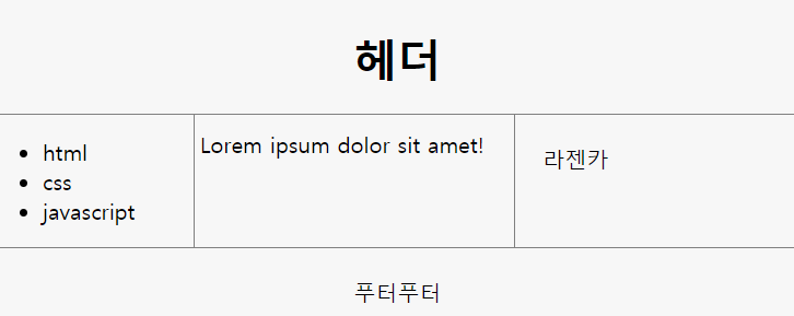
| <style>
.container {
display: flex;
flex-direction: column;
}
header{
border-bottom:1px solid gray;
text-align: center;
}
footer{
border-top:1px solid gray;
padding:20px;
text-align: center;
}
.content{
display:flex;
}
.content nav{
border-right:1px solid gray;
}
.content aside{
border-left:1px solid gray;
padding:20px;
}
nav, aside{
flex-basis: 150px;
flex-shrink: 0;
}
main{
padding:10px 22px 5px 4px;
}
</style>
<div class="container">
<header>
<h1>헤더</h1>
</header>
<section class="content">
<nav>
<ul>
<li>html</li>
<li>css</li>
<li>javascript</li>
</ul>
</nav>
<main>
Lorem ipsum dolor sit amet!
</main>
<aside>
라젠카
</aside>
</section>
<footer>
푸터푸터
</footer>
</div>
|
display: flex;
컨테이너에 등록함으써 flex 레이아웃 적용을 시작!
flex-direction : row;
row, row-reverse, column, column-reverse 값이 있다. row가 기본값, row는 세로 방향으로 행 레이아웃, column은 가로 방향으로 열 레이아웃.
1
2
3 1 2 3 4 5
4
5
<row> <column>
flex-basis : 200px;
row와 column에 따라 해당방향으로 기본 크기를 설정한다.
flex-grow : 1;
모두 1이면 스크롤을 늘릴때, 공평하게 크기가 늘어남, 다른 것들은 1, 하나는 2이면 2가 2배의 비율로 늘어난다.
flex-shrink: 0;
크기 클 수록 빨리 줄어든다. 0이면, 안줄어듬.
flex-wrap: nowrap;
wrap : 창 크기에 따라 줄바꿈이 됌.
nowrap : 줄바꿈이 안됌.
align-items: stretch;
stretch : 컨테이너만큼 아이템들을 늘림
flex-start/flex-end : 자기 크기를 유지함, 위/아래 부터 요소들 위치
baseline : 가운데 baseline에 맞추어 자기 크기를 유지함.
center : 수직 정렬
justify-content: center
수평 정렬
order
순서 설정 order:0 order:1
두 요소를 양 끝에 정렬하기
1
2
3
4
5
6
7
8
9
10
11
12
13
14
15
16
17
18
19
20
21
22
23
24
25
26
27
28
29
| <style>
#container {
width: 500px;
border: solid 1px #000;
display: flex;
}
#a {
width: 20%;
border: solid 1px #000;
margin-right: auto;
}
#b {
width: 20%;
border: solid 1px #000;
height: 200px;
margin-left: auto;
}
</style>
<div id="container">
<div id="a">
a
</div>
<div id="b">
b
</div>
</div>
|
Reference
https://www.inflearn.com/course/css-%EA%B8%B0%EB%B3%B8%EB%B6%80%ED%84%B0-%ED%99%9C%EC%9A%A9%EA%B9%8C%EC%A7%80/flex-%EA%B8%B0%ED%83%80-%EC%86%8D%EC%84%B1%EB%93%A4/